A website is an excellent tool to let your customers know about your business. Nowadays, more and more businesses are recognizing the importance of an online presence and some are even becoming dependent on it, so the pressure to own a website is notably crucial.
If you desire to have a bunch of visitors and true patrons, then your website needs to possess a design that dramatically attracts your proposed prospects. Contrary to some businesses who believe that web design is not significant and only converge on the content, the layout of your business’ website is unequivocally vital to its success.
In this post, we will explore 14 common misconceptions about website design to help you nail that perfect website layout.
ANYONE CAN CREATE A WEBSITE
While it is true that anyone with an idea can create a website using a drag-and-drop website builder, however, not everyone can build a good one. Designing and building a website is extremely critical when establishing your business and brand. This is something DIY platforms can’t give you therefore, it is imperative for your website to be tailored fit according to your business requirements. With that said, you could use a web design and development company to create your dream website and get it maintained too.
WEBSITE DESIGN IS EASY TO DO
One of the serious misconceptions about website design is that it is easy. Sure, it is easy if you’re equipped with website building skills, however, if you’re not a tech-savvy person and clueless about coding then you might find yourself in limbo. A stunning website may seem easy on the facade but it didn’t get that way without a lot of hard work. Each feature and layout on a website demands man-hours of coding and capability of refining it reflecting your unique brand.
ANY IMAGES CAN BE USED ON MY WEBSITE
Many people assume that any images they can find on the internet are free to use, what they don’t realize is that some images are protected by copyright. Always consider that an image is copyrighted unless you distinguish for certain otherwise. At all costs, avoid using an image you found on the internet without permission or else you’ll end up sued for a mistake done innocently. Furthermore, if you got someone to create the website for you, don’t assume that they recognize copyright law.
Take your own pictures, if you are confident with your ability or better yet, consider using stock photos that are available for free and paid.
MY BRAND’S LOGO MUST BE BIG
We unquestionably get why many businesses deem their logos should be precise and striking on their website to the point of making them too big, literally in your face. However, keep in mind that your website is more than just an ad. Yes, your logo helps to establish your brand and personality but people also want to use your website. Also, your logo has a big influence on the judgment of your website’s visitors, a big logo guarantees prospects to leave your website in seconds.
Don’t overkill it; keep your logo in a reasonable size.
I CAN COPY MY COMPETITOR’S WEBSITE
Copying your competitor’s website concept then tweaking and rewording yours to make it appear distinctive is absolutely not a good idea, you’re only putting your business in jeopardy. Yes, it is good to be aggressive to pull ahead from your competitors but don’t take it too far, keep in mind that what isn’t yours, isn’t yours. Emulating website design and content is a growing problem these days because websites are now the focal marketing point for most businesses. When building and writing the content of your website, always be original. Look at your competitor’s website to determine its strong and weak points then use this knowledge to take advantage of their weaknesses to refine your brand and build that killer website.
COMPLEX AND FANCY WEBSITES CONVERTS BETTER
This is another misconception that we should stop believing. The website design is essential in the user experience and conversion rate. According to studies, a website’s first impression is formed in less than 1 seconds. Therefore, first impression matters, however, making your website complex and fancy may not be the best solution. A simple and sleek website gives you an upper hand on the first impression plus it also loads quicker as opposed to a complicated and flashy website.
The one thing that all high-converting websites have is a strong value proposition to attract and retain visitors. The clarity and relevance of your value proposition guarantee a better conversion rate. At the same time, the more distractions, the lesser the clarity which could result in a lower conversion rate. So, if you’re contemplating on redesigning your website, give it a deep thought if you need it at all.
WEBSITE TESTING IS NOT REQUIRED
Yes, don’t be too quick to jump the gun. Your website needs to undergo a test before it gets launched and published. The purpose of the test is to check if all options and features are functional and it’s free of errors. This also gives you a chance to fix any errors found during the test. Write a checklist to ensure nothing is missed. Below is a checklist to help you get started.
???? Contents
???? Grammar, spelling, punctuation
???? Fonts
???? Images
???? Favicons
???? Forms
???? Navigation
???? Website speed
???? Mobile responsiveness
???? Google Analytics
MY WEBSITE IS DONE, THE JOB IS DONE
So your website is all done, now all you have to do is wait for prospects to contact you. Definitely not! Your website is not the end game but rather the foundation of your business. How can customers find you if they don’t know your website’s address? This is where effective marketing comes into play which also requires a collaborative effort of website optimization.
The web constantly evolves hence, it is imperative that you regularly update your website if you want it to stay at the top ranks. Unfortunately, some businesses don’t discern the gravity of maintaining their website to ensure all buttons and features are working as they should. And not only that, but you also need to keep up with the trends to upkeep your visitors interested. For instance, adding Halloween or Christmas designs and greetings for more engaging and personalized user experience. You might also want to try creating a fun contest to hook your visitors up and encourage loyal patrons.
MY WEBSITE SHOULD LOOK EXACTLY THE SAME IN A COMPUTER AND A MOBILE DEVICE
Really? Welp, if you’re up for a tedious and time-consuming coding and testing then sure.
Businesses must realize that a mobile view of your website makes it much smaller than a standard website. To ensure a good user interface and user experience when viewing your website from a mobile device, optimize it for a mobile view. When your website is viewed on a mobile device, there should be at least a few distinctions in look and interface like a “Classic” for computers and a “Mobile” view.
The most beneficial thing to do is design something alike to your desktop website, however, apply the least design for the mobile version, eliminating extra features you usually see and leave only what’s absolutely essential that makes the mobile experience easy and friendly.
THE MORE PAGES THE BETTER
While there is an element of truth to this misconception, we’ll prove to you that less is more. Converge on quality over quantity because it’s what both search engines and customers do look for. Your website must converse about your product or services, answer questions and offer genuine value. Usually, this includes at least:
- A Homepage
- An About page
- A Blog
- A Contact page
You may choose to include a testimonial page or past work but keep things simple and streamlined to avoid overwhelming your visitors. Also, don’t turn to blogs as a way to update your website because each blog post is technically a new page.
Most search engines strive to deliver the most useful result of a search, therefore concentrate on quality.
HOMEPAGE IS THE MOST VALUABLE PAGE
Another misconception about website design is that the homepage of your website is the most important page. Studies and researches show that visitors spend most of their time on blog content, about page and other minor pages of your website. Its because most people find your website through specific searches, social media, and links from other websites. Therefore, don’t put all your resources into your homepage, dissect where the preponderance of your visitors are accessing from your website then optimize from there to attract more in.
EMPTY SPACES ARE A WASTE
Believe it or not, empty space is not always wasted space. Most stunning websites nowadays have this minimalist aesthetic layout, thanks to empty spaces. In website building, it’s best to leave your content in some breathing room.
Nobody wants a crowded and cluttered website with various information taking up the whole page to the extent where visitors don’t want to look at it anymore, it’s terrible. If you want your visitors to focus on the content, having empty spaces or whitespaces can positively deliver that experience. It makes your content well-spaced, organized, and readable.
VISITORS DON’T SCROLL DOWN
In the past, the idea of space-saving was the thing in website design, contents were filled above the fold so users wouldn’t miss anything below it. But a study in 2013 by Chartbeat revealed: “many visitors scroll down the page before it finishes loading…” it appears that most visitors will scroll regardless furthermore decide whether or not they will spend time browsing the rest of your content on the page. Also, stuffing everything above the fold creates chaos on your website, hence interactively design your website by engaging users to scroll, click and move around.
VISITORS UNDERSTAND FUNCTIONS ON YOUR WEBSITE AUTOMATICALLY
Many businesses assume that their visitors understand the functions of the buttons of their pages and they know how to reveal information hidden behind large graphics by hovering over and whatnot. Sadly, most functionalities aren’t immediately comprehensible to the user.
Avoid using counter-productive design patterns because they are often missed by many visitors. Design your website for better user interface and user experience, this will allow your visitors easy navigation and quickly find the information they are looking for.
Conclusion: Website design is critical for the reason that it impacts how your visitors perceive your brand. The impact you make on them can either get them to continue on your page and learn about your business or withdraw and turn to a competitor. We hope you’ve learned a thing or two in our common misconceptions in website design. If you feel we’ve dropped some out, let us know.
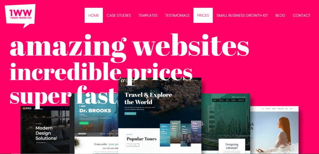
ARE YOU STRUGGLING WITH YOUR WEBSITE DESIGN?
We take pride in building amazing websites in just 7 days without breaking the bank because we believe that stunning websites don’t need to be expensive. We’ve helped businesses grow for over a decade.
We build websites at a fixed price, no crazy contracts, and no lock-in maintenance cost.
If you aren’t 100% satisfied with our work, kick us to the curb before we deploy the site, provided that you have given us what is needed for us to complete the project, and we will give you your money back no questions asked.
Do you plan on creating a website or revamping an old one? Tell us about your project today.